August 2, 2023
Solved

Graphs x-axis tabels - Date Time Scale Options

  • August 2, 2023
  • 4 replies
  • 0 views

Dear community,

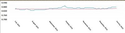
I am working on a graph that shows the daily FX rates. 

I am bringing the data in through an SQL Data Adapter and have set up the following settings in regard to the data and what is shown on the x-axis:

Rianne_0-1690968892924.png

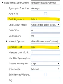
Data is shown in days, but the x-axis name are 'summed' to the months. 

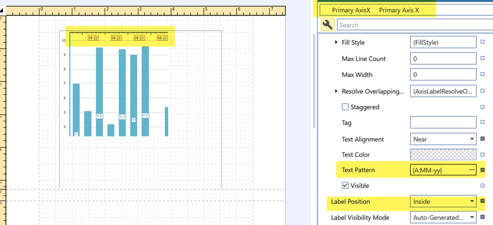
This works great except for the fact that it writes the month as full. I think it's based on the Time Dimension Description because the date format in the data table is: MM/DD/YYY

Rianne_1-1690969773346.png

As you can see the graph is quite small and the naming takes up a big part. 

Does anyone know if it's possible to adjust the sourcing of this naming/description? Maybe to a UD8 TimeDescription member or adjust the description of Time in the graph itself, or maybe through the data table or data adapter? 


Thanks in advance!


Best answer by JackLacava

This led me to some unknown places, so thank you 😉

First, select your axis by clicking on it; then look for the Label â–¶ Text Pattern property to set your custom pattern. Click on the ellipsis to open the editor; basically you select Argument, then one of the prebuilt formats, and you can then manually customize it simply by typing in the central area.

The result can be seen below (hopefully - I know it's a bit small).

JackLacava_1-1691158237136.png


4 replies

August 4, 2023

Just to clarify, is this a BiViewer component or a Report component?


RianneAuthor
August 4, 2023

Hi Jack,

Sorry for the unclarity, this is related to a Report Component!

August 4, 2023

This led me to some unknown places, so thank you 😉

First, select your axis by clicking on it; then look for the Label â–¶ Text Pattern property to set your custom pattern. Click on the ellipsis to open the editor; basically you select Argument, then one of the prebuilt formats, and you can then manually customize it simply by typing in the central area.

The result can be seen below (hopefully - I know it's a bit small).

JackLacava_1-1691158237136.png


RianneAuthor
August 11, 2023

This worked perfect and got me exactly what we needed, thank you very much! Very interesting feature to remember for future graphs as well. Happy to also bring you to new places in OneStream, we all learn something new every day! ðŸ˜Š

August 17, 2023

That is very useful. Do you think I can achieve the same in an advanced chart component?

Tried the following but did not work, when I change the argument type to Date Time the custom formatting works but I get the x-axis showing a 3-month interval, instead of 1 month.

aelmehelmi_0-1692248708647.png

thanks!

August 17, 2023

Dashboard Advanced Charts are a bit of a black art, I'm not sure... I suspect it might have something to do with how much space the chart decides is available, reacting to smaller areas by collapsing periods. Maybe try expanding the horizontal space dedicated to the chart and see if it changes.

There might be something more about it in the new book but I honestly don't know.

February 28, 2024

Hi JackLacava,

In the report component I am facing a weird issue. So when I am running the intercompany out of the box report the time showed on the OneStream app is perfect but when I export this report as an excel, it shows the incorrect time. Do you know a way we could rectify this? Thanks!

February 28, 2024

You might want to bring it up with Support, if it's the OG report this stuff should not happen. If it's customizable (I don't think so but I'm not sure), they will indicate how to do it.